SOL Medical: brand identity, print and website
A distributor of medical aids in Turin, with a ring of joined circles for a logo and a website in Italian.
- Client
- SOL Medical
- Sector
- Medical devices and aids
- Location
- Turin, Italy
- Year
- 2026
- Services
- Branding, Web design
- Visit the site
- Visit the site
The brief
SOL Medical, in Turin, distributes and presents medical aids and devices across Italy, for continence, orthopaedics, breathing and rehabilitation, and works so that Italy’s national health service (SSN) reimburses them. In 2026 we drew its identity from scratch, designed its print and fair material, and designed, wrote and built its website.
What we made
The logo is a ring of circles, some joined by short stems, open on the right, with the name in the opening. We delivered it with a 28-page brand book and a logo kit.


All the pieces below were produced. The brand book lets the logo split: the name alone for small surfaces, the icon alone for patterns. So the icon fills the stand and runs off the business cards, while the name alone tops the tablecloth and heads the site.


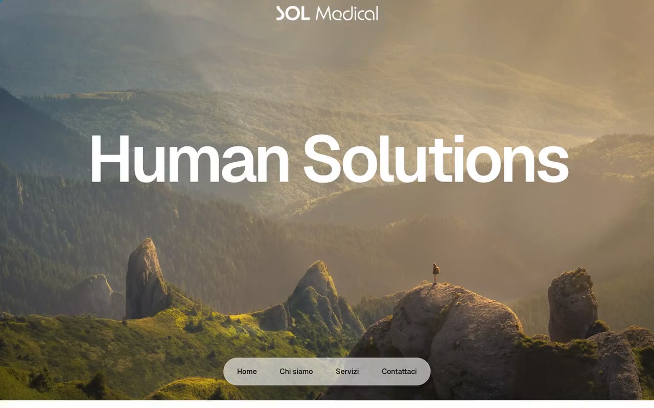
The website, solmedical.group, is in Italian: we designed, built and wrote it, and chose its photos. On the site, the mountain landscape and the photos centred on people are AI-generated.


